NotebookLM infographics: from a pile of sources to one PNG
The Infographic button turns a notebook's sources into a single visual summary in about a minute. Most people click Generate and take whatever comes out. The pencil menu next to the button is where the actual control is, and the output has one format quirk worth knowing before you build a workflow on it.
NotebookLM was renamed Gemini Notebook in July 2026. The Infographic output works identically under both names, and everything below applies to either.
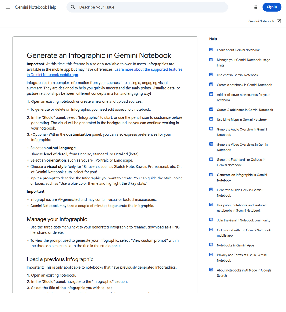
Open the notebook, find Infographic in the Studio panel, and click the pencil icon before generating: that's where you set detail level, orientation, visual style and a custom prompt. Generation runs in the background and can take a couple of minutes. The result downloads as a PNG from its three-dot menu. There is no editing after the fact: to change anything, adjust the prompt and regenerate.
What the Infographic button actually makes
One image. NotebookLM reads the sources in the notebook and lays out the main points, key numbers and relationships as a designed visual (layout and hierarchy included, no Canva step). That makes it the right Studio output for a narrow job: something a colleague can absorb in thirty seconds from a chat message, a slide, or a pinned post.
It sits between two neighbours that get confused with it. A mind map is interactive: you expand branches and click through to sources, which makes it the explore-your-material tool. A slide deck is sequential: an argument in order. The infographic is neither: it's static, single-frame, and optimized for being looked at rather than worked with. If you catch yourself wanting to click on part of an infographic, you wanted the mind map.
Generate one
- Open a notebook that already has its sources loaded. The infographic draws only from what's there, so a thin notebook makes a thin graphic.
- In the Studio panel, find Infographic.
- Click the pencil icon to customize before generating (next section), or hit generate to accept the defaults.
- Wait: Google says it *may take a couple of minutes*, and it runs in the background, so you can keep chatting with the notebook meanwhile.
- Open the finished infographic; its three-dot menu holds rename, download, share and delete.
The pencil menu is the whole game
The default output is fine. The customized output is usually the one you can actually publish. Per Google's documentation, the pre-generation settings are:
- Detail level: Concise, Standard or Detailed (Detailed is in beta). Concise for a social post, Detailed for a summary someone will actually study.
- Orientation: Square, Portrait or Landscape. Pick for the destination: portrait for phones and stories, landscape for docs and slides, square for feeds.
- Visual style: 10 named presets (next section), or let it auto-select. Style options are available to users 18 and over.
- Output language: set explicitly if your sources and your audience don't share a language.
- Custom prompt: the most useful field. Google's own example is the right shape: *"Use a blue color theme and highlight the 3 key stats."* Naming the specific stats, sections or comparison you want on the graphic beats any style setting.
One habit worth stealing: the three-dot menu can show you the custom prompt used for any previous infographic. When one comes out right, copy that prompt into a note. It's the closest thing to a reusable template the feature has.
All 10 visual styles, and what each one is actually for
Google's support page names only three example styles before trailing off into "etc." The full list, confirmed on Google's own Workspace Updates blog for the 20 March 2026 rollout, is 10 named presets, plus auto-select as the default:
Style          Best for
------------------------------------------------------------
Professional   Corporate presentations, business overviews
Scientific     Textbook-like, educational or research content
Editorial      Newspaper-style, aged look for a classic feel
Instructional  Step-by-step guides, tutorials, processes
Bento Grid     Sectioned, concise layout for structured data
Sketch Note    Hand-drawn, creative and informal
Kawaii         Playful, lighthearted, for informal projects
Anime          Character-driven, illustrated storytelling
Clay           Vibrant, modern, dynamic
Bricks         Blocky, Lego-style, playful

Descriptions per Geeky Gadgets' walkthrough of the rollout;
style names confirmed directly on Google's own announcement.
Note: Geeky Gadgets' own writeup shortens "Sketch Note" to
"Sketch" in its description column; the pencil menu itself
uses the full name, "Sketch Note".
In practice the 10 collapse into two decisions worth making before you touch the pencil menu. First, formal or not: Professional, Scientific and Editorial read as work output; Kawaii, Anime, Clay and Bricks read as social or classroom content, not something you'd hand to a client. Second, structure or story: Instructional and Bento Grid are for material that's actually a list or a process; Sketch Note and Anime are for material that benefits from a narrative feel. If auto-select keeps landing on the wrong side of either line for your notebook, naming the style directly in the pencil menu is more reliable than adjusting the custom prompt around it.
What actually goes wrong, and the fix
Three failure patterns account for most disappointing infographics, and each has a specific, unglamorous fix. The first is a thin source notebook: the feature only synthesizes what you've actually uploaded, so a notebook with one short PDF produces a sparse graphic no matter which style you pick. Add sources before you regenerate, not after. The second is auto-select guessing wrong: it's a reasonable default for a mixed notebook, but for anything narrow (a single dense research paper, a single meeting transcript) naming a style explicitly in the pencil menu, per the two-question framework above, beats trusting the guess. The third is the Detailed level itself: Google still labels it beta as of this writing, meaning the extra density it promises over Standard is the least consistent setting in the menu. If a Detailed output comes back cluttered or missing a stat you expected, dropping to Standard and naming the specific numbers you want in the custom prompt field is more reliable than trying to fix it within Detailed.
One age-related wrinkle worth knowing if you administer accounts for other people: style options and the feature as a whole are restricted to users 18 and over, which means a teacher or team lead setting up notebooks for a mixed-age group will see the Infographic option behave inconsistently across accounts for reasons that have nothing to do with the notebook itself. That's account-level gating, not a bug, and no amount of pencil-menu tweaking works around it.
The 20 March 2026 style rollout itself is worth understanding for timing reasons, not just the style list it added. Google's own Workspace Updates post lists it as available immediately on launch day for both Rapid Release and Scheduled Release domains, the two release tracks Google Workspace admins can choose between for how quickly new features reach their organization. That matters for exactly one practical reason: unlike features that stagger out to Scheduled Release domains weeks after Rapid Release, this one didn't, so an account not seeing all 10 styles today is very unlikely to be waiting on an admin-side release track and far more likely to be hitting the 18-and-over gate or a client (mobile app vs. web) gap instead. Worth remembering the next time a different Studio feature seems to be missing entirely: check which release track explains the gap before assuming the feature simply doesn't exist yet.
Getting it out: the PNG quirk
Download hands you a PNG, and that's the only file format. No PDF, no SVG, no editable layers. The practical consequences: text on the graphic can't be corrected after the fact, so a typo or a wrong number means a prompt tweak and a regeneration, not a quick edit. And if the destination demands a PDF, you're converting the PNG yourself (any print-to-PDF dialog does it).
Sharing has real rules attached. A shared link only works for people who have access to the notebook, unless an owner or editor makes the infographic publicly available, and public sharing is disabled entirely on Workspace Enterprise and Education accounts. Deleting an infographic kills every link you've shared to it. For anything that must outlive the notebook, download the PNG and share the file.
The infographic rarely travels alone. It usually tops a report or summary built from the same notebook. The exporter extension gets the written half out as PDF, Word or Markdown with citations intact; drop the PNG in alongside it and the whole package is portable.

What an Infographic costs against your quota
Gemini Notebook stopped counting flat daily caps on 2 September 2026 in favor of a shared compute budget that factors in "prompt complexity, the models and features you use, the length of your chat and specific features," per Google's own announcement, covered in full in our usage limits explainer. Google hasn't published a separate line-item cost for Infographic specifically, but the same logic that applies to Video Overviews and Slide Decks almost certainly applies here: a Detailed-level infographic built from a large, multi-source notebook is a heavier action than a Concise one from a single short document, and will likely draw more from your 5-hour budget accordingly. If you're rationing quota, the practical move is the same one that applies to every Studio output under the new system: generate a Concise version first to confirm the source material and prompt are right, then spend a Detailed regeneration only once you're not just guessing at the style and prompt.
Treat the numbers as a draft
Google's own support page carries the warning plainly: infographics are AI-generated and may contain visual or factual inaccuracies. In practice the failure mode is subtle, a statistic attributed to the wrong category, a label swapped between two bars, and it's invisible unless you check. Before an infographic goes anywhere public, verify every number on it against the notebook's sources in chat, where answers come with citations. An infographic is a rendering of the sources, not a citation of them.
People also ask
Is the NotebookLM infographic feature free?
Yes. Infographic is one of the standard Studio outputs, not a paid-only extra. Heavy use draws down the shared 5-hour compute budget faster than light use; see our usage limits explainer for how that budget works and the plans guide for what paid tiers raise.
What format do NotebookLM infographics download in?
PNG only. There's no PDF, SVG or editable export. Convert the PNG yourself if a destination requires PDF, and regenerate rather than edit if something on the graphic is wrong.
Why don't I see the Infographic option?
The usual reasons: you only have viewer access to the notebook (generating requires edit access), you're under 18 (style options and the feature are limited to adults), or the rollout hasn't reached your account or platform yet. The mobile apps can lag the web version.
Can I edit an infographic after it's generated?
No. The output is a flat image. The workflow that works: open the three-dot menu to see the custom prompt used, refine that prompt, name the exact stats or sections you want, and generate again.
What are all the NotebookLM infographic style options?
Ten named presets: Professional, Scientific, Editorial, Instructional, Bento Grid, Sketch Note, Kawaii, Anime, Clay and Bricks, confirmed on Google's own Workspace Updates blog for the 20 March 2026 rollout, plus auto-select as the default. Google's support page only names three examples before trailing off into "etc."
Exportera din NotebookLM med ett klick
Gratis Chrome-tillägg. PDF, Word och Markdown. Renderas på din egen dator — ingenting laddas upp.