Executive Dashboard
Folien, Videos & InfografikenEinsetzen in: Folien / Infografik
A high-density visual summary resembling a real-time command center. It uses "widgets," circular progress rings, and financial data clusters (such as CapEx, EBITDA, and IRR) to provide an at-a-glance overview of complex systems, project health, or national economic multipliers. Best for quarterly business reviews (QBRs), financial projections, project health tracking, and KPI reporting.
Geteilt von Mark Carver — Visual Style Guide for NotebookLM Presentations – Anerkennung, wo sie hingehört.
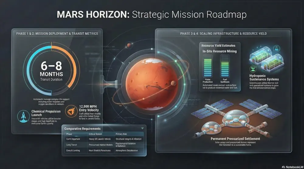
A sleek Executive Dashboard aesthetic featuring a dark-mode UI. Include various data visualization 'widgets' such as circular progress rings, segmented bar charts, and financial data clusters showing CapEx and ROI. Use vibrant accent colors for data points against a refined, dark-gray background with subtle glass-morphism effects.
So verwenden Sie ihn
- 1Wählen Sie im Studio-Bereich Folien oder Infografik und öffnen Sie das zugehörige Prompt-Feld.
- 2Fügen Sie die Stilvorgabe ein.
- 3Generieren, dann bei Bedarf die Formulierung anpassen, falls das Ergebnis abweicht.
Eckige Klammern markieren die Stellen, die Sie durch Ihr eigenes Thema oder Ihre Frage ersetzen.
Weitere folien, videos & infografiken-Prompts
- ChalkboardWhite "chalk" lines on a dark slate background with textured shading. Best for academic lectures, physics/math proofs, and historical retrospectives.
- WhiteboardA clean look resembling markers on a glossy whiteboard. Best for internal team briefings, "live" brainstorming sessions, and agile project updates.
- Sketch NotingHand-drawn icons and connectors with a classic "visual note-taking" feel. Best for executive summaries, workshop synthesis, and human-centric storytelling.
- Graphite & Charcoal RealismA fine-art style using monochromatic hand-drawn textures, cross- hatching, and realistic smudging. Best for high-stakes ethical discussions, historical reflections, or "Day in the Life" human-centric storytelling.