Swiss Design
Diapositivas, video e infografíasVa en: Diapositivas / infografía
Focus on strict grids, sans-serif typography, and bold geometric shapes. Best for high-end design portfolios, clear data infographics, and minimalist communication.
Compartido por Mark Carver — Visual Style Guide for NotebookLM Presentations — crédito a quien corresponde.
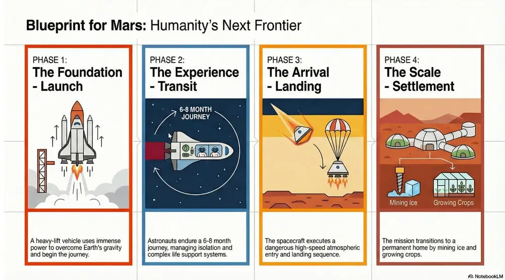
A master-level Swiss Design aesthetic following a strict mathematical grid. Feature bold geometric shapes, high-contrast primary colors against a neutral light-gray background, and ultra-clean sans-serif typography. The layout must emphasize objective clarity, asymmetrical balance, and extreme whitespace.
Cómo usarlo
- 1En el panel Studio, elige diapositivas o infografía y abre su cuadro de prompt.
- 2Pega la especificación de estilo.
- 3Genera y ajusta el texto si el resultado se desvía.
Los corchetes marcan las partes que debes reemplazar con tu tema o pregunta.
Más prompts de diapositivas, video e infografías
- ChalkboardWhite "chalk" lines on a dark slate background with textured shading. Best for academic lectures, physics/math proofs, and historical retrospectives.
- WhiteboardA clean look resembling markers on a glossy whiteboard. Best for internal team briefings, "live" brainstorming sessions, and agile project updates.
- Sketch NotingHand-drawn icons and connectors with a classic "visual note-taking" feel. Best for executive summaries, workshop synthesis, and human-centric storytelling.
- Graphite & Charcoal RealismA fine-art style using monochromatic hand-drawn textures, cross- hatching, and realistic smudging. Best for high-stakes ethical discussions, historical reflections, or "Day in the Life" human-centric storytelling.